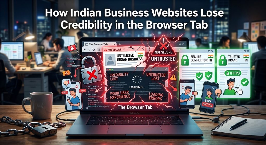
Your homepage took weeks to design. Your copywriter spent hours on the headline. Your SEO agency is billing you every month. And yet, the first thing a visitor actually sees when they land on your website has nothing to do with any of that. It lives in a strip of interface just 16 pixels wide, at the very top of their browser. Most Indian businesses have never thought about it. Most have no idea it can make or break a first impression before a single word of their copy is read.
Browser Credibility at a Glance
- A missing or generic favicon signals an unfinished website before a visitor reads a single word on the page.
- Indian users browse primarily on mobile Chrome, where favicon visibility is heightened during every tab-switch.
- Browser-level branding fixes are genuinely low-effort and can be shipped by a developer in a single afternoon.
The First Brand Signal Happens Before the Page Loads
When someone types your URL or clicks a search result, the browser does not wait for your hero image to load before impressions begin forming. The browser tab appears immediately. It shows two things: the page title and the favicon. What is a favicon? It is the small icon that sits in the corner of every open tab, visible from the moment a page starts loading. On mobile Chrome, where the majority of Indian internet users spend their browsing sessions, these signals are more prominent than most developers realise. A row of open tabs in mobile Chrome is a row of tiny brand icons. Yours is in that row whether you have designed for it or not.
The problem is that most Indian small business websites appear in that row as a blank square, a generic globe icon, or, at best, the first letter of the domain rendered in a default sans-serif font. That is not neutral. That is a signal. And the signal reads: this website was not finished.
The Favicon, Your Brand’s Smallest Business Card
The favicon is not decoration. It is functional identity. When a user has eight tabs open and wants to return to your site, they scan the tab bar visually. They are looking for your icon. If you have not given them one, they are searching for a blank square and hoping for the best. If your competitor has a clean, recognisable icon and you do not, the comparison happens passively, without the user consciously deciding to compare anything at all.
Modern websites ship multiple favicon sizes to handle different surfaces: 16×16 and 32×32 pixels for standard tab display, 180×180 pixels for Apple touch icons when someone saves your site to their iPhone’s home screen, and an ICO file for older browser compatibility. Each size is the same image, resized and sometimes simplified. The goal across all of them is instant recognition in very small spaces.
A well-crafted favicon is usually derived from your logo, distilled to its simplest recognisable form. A stylised initial. A brand mark. A simplified icon pulled from your existing visual identity. Intricate logotypes simply do not scale to 16 pixels. Strong, distinctive shapes do. The businesses that get this right have an icon you can identify in a crowded tab bar without reading the title next to it. That kind of recognition compounds over time and across every device a user touches.
Why Indian Mobile Chrome Users Notice the Gap Faster
Chrome commands the overwhelming majority of India’s mobile browser market share, and that matters here because Chrome’s tab management on Android puts favicons front and centre. The tab switcher view shows a grid of open tabs, each with its favicon and title clearly visible. Users switch between tabs frequently, especially when comparing vendors, checking prices, or bouncing between a service provider’s website and a WhatsApp conversation about that same purchase.
When an Indian consumer is comparing three vendors, all three tabs are open at once. The one with a polished favicon looks established. The one with a blank square looks like something might be wrong. This judgment happens in milliseconds. It is not a deliberate assessment. It is pattern recognition built from years of browsing experience. A missing favicon triggers a low-grade doubt that the user may never consciously articulate, but that colours every interaction that follows on that page.
This effect is not unique to India, but the mobile-first nature of Indian browsing amplifies it considerably. Desktop users often have dozens of tabs open and pay less attention to individual icons. On mobile, tabs are fewer, icons are more visible, and comparisons are more direct. The same business that might look polished on a desktop can look unfinished on a mobile tab bar, entirely because the favicon was never considered during the build.
When a Generic Icon Is Actually Worse Than No Icon
Some developers believe the problem is solved once any favicon is present. A site displaying the default browser globe icon, or the auto-generated favicon from a popular website builder, is not meaningfully better than a site with no favicon. In many cases, it actively makes things worse.
The generic globe icon signals that the developer did not bother. A platform-default favicon, particularly a recognisable one from tools that millions of Indian small businesses use to get online, signals that the site is a template setup with no investment in brand identity. For a business trying to project seriousness and professionalism, that is exactly the wrong message to send to someone visiting for the first time and forming their initial impression.
The favicon occupies a persistent position in the browser interface. It is visible the entire time a user is on your site. It shows up in bookmarks, in browser history, and in some browsers’ interfaces alongside search results. Every time it surfaces, it either reinforces or quietly contradicts the impression your other design decisions are working to create. A homepage can be excellent. If the favicon is generic, it silently undercuts everything else.
The Other Browser Signals Your Website Is Probably Ignoring
The favicon is the most visible gap, but not the only one. The page title displayed in the browser tab is equally important and nearly as commonly neglected. Many Indian business websites have page titles that read “Home” or “Untitled Document” or, worse still, the name of the CMS template the developer started with three years ago.
A proper page title should include the business name and the page’s primary purpose, structured so it remains recognisable even when the tab is minimised to a narrow strip. A tab reading “Mumbai Wedding Photographers | Riya Studios” is doing brand work passively, every time a user glances at their tab bar. A tab reading “Home” is doing nothing at all. The fix takes minutes per page and seconds per page if a CMS plugin enforces the pattern automatically across the whole site.
Then there is the web app manifest, a short JSON file that tells mobile browsers how to display your site when a user saves it to their Android home screen. Without a manifest, your site receives a generic screenshot thumbnail in that shortcut. With one, your site gets your branded icon, your chosen name, and the option to open in a full-screen experience. For Indian businesses whose users spend the majority of their digital time on Android phones, this difference in how the product feels is real and worth a developer’s thirty minutes.
Open Graph tags, while primarily relevant to social sharing, also control how your pages appear when shared via WhatsApp. A missing or misconfigured Open Graph image means your link previews show a blank thumbnail or an unrelated image pulled at random from the page. That weakens click-through rates from a channel where visual previews directly influence whether the link gets tapped at all. In a country where WhatsApp is often the primary way content moves between people, that is a concrete and measurable gap in reach.
What Your Developer Can Ship in One Afternoon
Browser-level branding is genuinely low-effort work. It is not a redesign project. It is not an audit of your entire codebase. It is a few focused hours of implementation that produces results visible on every single page load, across every device, for every visitor from that point forward.
The favicon requires a source file, ideally a high-resolution vector or PNG of your logo mark. That file is processed into the full required set of sizes. Several generators online can produce the complete set from a single source image in under a minute. The HTML to reference these files is a small collection of link tags added to the head section of your pages. On WordPress, a single setting in the Customiser handles the upload and injects the correct tags site-wide without touching a line of code.
The web app manifest is a short JSON file, typically under thirty lines, defining the app name, icons, theme colour, background colour, and display mode. Writing one from scratch takes around fifteen minutes for a developer familiar with the format. Adding the link tag that references it takes seconds. Pairing this with correctly sized icons means your site behaves like a named, branded application when saved to an Android home screen rather than an anonymous screenshot the user cannot identify later.
Page titles require a systematic audit across all major page types: the homepage, service or product pages, the blog index, individual posts, and the contact page. Each should follow a consistent pattern that includes the business name. On most CMS platforms, a single plugin or theme setting can enforce this pattern site-wide and prevent future pages from defaulting to generic titles as new content is added over time.
Open Graph tags need a baseline set of four meta tags per page: og:title, og:description, og:image, and og:url. A single branded image at 1200 by 630 pixels, set as the site-wide default, covers the majority of sharing scenarios immediately. High-priority landing pages can have custom images for sharper performance, but the default image alone makes a visible and immediate difference to how every shared link looks in WhatsApp previews.
Browser Signals That Affect Perceived Credibility
| Signal | Without Proper Setup | With Proper Setup |
|---|---|---|
| Favicon | Blank square or default browser globe | Branded icon recognisable at 16 pixels |
| Page title | “Home” or the CMS template name | “Page Name | Brand Name” on every page |
| Web app manifest | Generic screenshot on Android home screen | Branded icon and named shortcut on home screen |
| Open Graph image | Blank or unrelated thumbnail in WhatsApp | Consistent branded image on every shared link |
What Visitors Already Think Before Your Homepage Loads
The smallest piece of your website is doing a job you never assigned it. The browser tab is open the entire time a visitor is on your site. It is visible during every tab-switch, every bookmark save, every moment a user steps away and then comes back. It is the identifier that brings people back to your site after they check a competitor’s page. For most Indian business websites today, that identifier is either blank or generic. That is not a minor oversight. It is the first thing your next customer sees, and it speaks before your brand gets the chance to.
Fixing it costs an afternoon. Ignoring it costs trust in increments that never show up clearly in a single analytics report, but that accumulate across every session, every comparison, every moment a visitor glances at the tab bar and thinks, even briefly, that something about your website looks unfinished. Your homepage might be excellent. Your content might be convincing. Your offer might be the best in the market. But the browser tab got there first, and it already had its say.