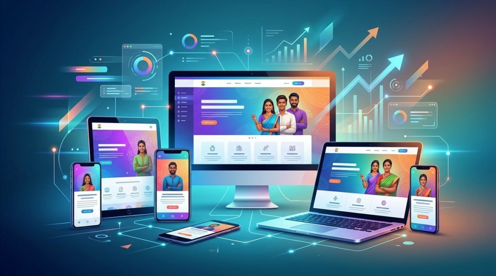
Building websites that look great and work perfectly on any device is more important than ever in 2026. With millions of users accessing sites via smartphones, tablets, and desktops, web developers and designers need to stay updated on the latest responsive design trends. These trends not only improve user experience but also boost engagement, SEO rankings, and conversions. Let’s explore what’s shaping the future of web design in India and how you can implement these trends effectively.
In 2026, responsive web design revolves around mobile-first approaches, AI-driven personalization, faster performance, accessibility, and seamless integration of modern technologies. Adapting to these trends ensures websites are engaging, accessible, and future-ready for Indian users.
The evolution of responsive web design in 2026
Responsive web design has advanced significantly over the past few years. What was once mainly about flexible layouts and media queries now involves AI integration, progressive web apps, and accessibility as core components. The goal remains the same: create websites that adapt perfectly to any device and screen size while delivering a smooth, engaging experience.
In 2026, the focus is on building websites that are fast, intuitive, inclusive, and personalized. This shift is driven by the increasing use of smartphones in India, where over 80 percent of internet traffic comes from mobile devices. Additionally, search engines like Google prioritize mobile-first indexing, making responsiveness a critical part of SEO strategies.
Key responsive web design trends shaping 2026
1. Mobile-first and AI-powered personalization
A mobile-first approach continues to be the backbone of responsive design. Websites are now built primarily for mobile devices with scalable interfaces that adapt to larger screens. AI enhances this experience by delivering personalized content based on user behavior, location, and preferences.
For example, a fashion retailer in India can use AI-driven personalization to showcase clothing options based on the user’s browsing history, local climate, and cultural festivals. This targeted approach increases engagement and conversion rates.
2. Seamless dark mode and low-light UX
Dark mode has become a standard feature across devices. In 2026, websites are optimized for easy toggling between light and dark themes. This not only reduces eye strain but also aligns with user preferences.
Designers should ensure that color schemes, images, and text remain legible and aesthetically pleasing in both modes. Dark mode compatibility improves user satisfaction and accessibility, especially for users browsing at night or in low-light conditions.
3. Progressive Web Apps (PWAs) and offline capabilities
PWAs offer a native app-like experience on the web. They load quickly, can work offline, and support push notifications. In India, where connectivity can vary, PWAs are particularly beneficial for e-commerce, news portals, and government services.
Integrating PWA features allows users to access content seamlessly, even with unstable internet, boosting engagement and retention.
4. Accessibility as a standard feature
Inclusion is a top priority in 2026. Websites must adhere to WCAG guidelines, ensuring content is accessible to users with disabilities. Features include screen reader compatibility, keyboard navigation, and color contrast adjustments.
Making websites accessible not only broadens your audience but also improves overall user experience and SEO.
5. Voice search and conversational interfaces
Voice search has gained widespread popularity, especially with the rise of smart speakers and voice assistants like Google Assistant and Alexa. Responsive sites are now optimized for voice queries, enabling users to navigate and find information efficiently.
Implementing conversational interfaces, chatbots, and voice-activated commands can significantly enhance user interaction and satisfaction.
6. AI-driven content and layout customization
AI algorithms analyze user data to dynamically adjust website layouts and content. For example, a news portal can display trending topics or regional stories based on user location or browsing habits.
This level of customization makes websites more relevant and engaging, encouraging longer visits and repeat traffic.
7. Faster load times with optimized media
Page speed remains a crucial ranking factor. In 2026, websites use advanced techniques such as lazy loading, compressed images, and efficient media queries to ensure fast loading on all devices.
Indian users increasingly expect instant access, especially given the rise of 4G and 5G networks in urban areas.
8. Enhanced visual storytelling with micro-interactions
Micro-interactions like subtle animations, hover effects, and scroll-triggered animations make websites more lively and engaging. They guide users intuitively through content and encourage exploration.
Designers should balance aesthetics with performance to avoid slow load times.
9. Modern typography and adaptable layouts
Typography now adapts dynamically to different screen sizes, ensuring readability across devices. Using variable fonts and scalable units allows text to stay legible without compromising design.
Flexible layouts combine grids and CSS flexbox to create visually appealing structures that reflow seamlessly.
10. Sustainability and eco-friendly design practices
Sustainable design practices are gaining prominence. Websites are optimized for minimal energy consumption, employing efficient coding and hosting solutions to reduce carbon footprints.
This approach resonates with environmentally conscious users and aligns with global and Indian sustainability goals.
Practical steps to implement these trends
-
Prioritize mobile design by starting your development with a mobile-first mindset. Use responsive frameworks like Bootstrap or Tailwind CSS for consistency.
-
Integrate AI tools that personalize content, such as recommendation engines or chatbots, to create tailored user experiences.
-
Optimize media assets by compressing images and videos, and implementing lazy loading to improve speed.
-
Ensure accessibility by following WCAG guidelines, using semantic HTML, and testing with assistive technologies.
-
Test across devices using emulators and real hardware to identify responsiveness issues early.
-
Leverage progressive enhancement: add advanced features like PWA capabilities only after ensuring core content is accessible.
-
Use analytics to monitor user behavior and adapt layouts and content dynamically.
-
Stay updated with the latest CSS features like container queries and CSS variables to build adaptable and future-proof designs.
Techniques and common mistakes at a glance
| Techniques | Mistakes to Avoid |
|---|---|
| Responsive grid layouts with CSS flexbox and grid | Fixed-width elements that break on small screens |
| Lazy loading images and videos | Overloading pages with unnecessary media |
| Accessibility testing with tools | Ignoring contrast or keyboard navigation issues |
| Progressive enhancement for features | Adding complex features without fallback plans |
| Optimizing media for speed | Using uncompressed or large media files |
“In 2026, a website’s success hinges on how well it adapts to the user’s device and preferences. Incorporating AI, accessibility, and speed optimizations creates memorable digital experiences.” – Web design expert in India
Designing for the Indian user in 2026
India’s diverse audience demands websites that are not only responsive but also inclusive and culturally relevant. Incorporate regional languages, local imagery, and culturally appropriate content to resonate better.
Mobile devices dominate access, so ensure your designs are lightweight, fast, and easy to navigate. Use local festivals, events, and idioms to make content more relatable.
Keeping pace with the future of web design
Staying current with responsive web design trends in 2026 requires continuous learning and adaptation. Use modern tools and frameworks, test regularly, and listen to user feedback. The web landscape evolves quickly, but a focus on user-centric, accessible, and fast websites will always pay off.
Encourage your team to experiment with new CSS features, AI integrations, and accessibility enhancements. Remember, the goal is to create websites that serve the user’s needs, regardless of device or location.
Your next step in responsive web design
Adopting these trends now sets your website up for success in the coming years. Focus on building flexible, fast, and accessible sites that feel personal and engaging. With India’s digital growth accelerating, your responsiveness to these shifts will help your brand stand out and grow.
Keep experimenting, testing, and listening to your audience. Responsive design in 2026 is about crafting experiences that are seamless, inclusive, and tailored—making every click count.